
Pendo recently rolled out a refreshed visual identity including a new logo, visual system, website, and product UI. This is the story of how we took what our customers love most about us and turned it into a bolder, pinker Pendo.
The Origin of “Bold Pink”

From Pendo’s beginnings, two things have set us apart: a distinctly Southern flair and pink. Vibrant, quirky, unapologetic pink. Originally pink occupied an accent role in the Pendo brand — an experiment of sorts. Following positive feedback to the increasing volume of pink t-shirts, swag, and displays at conferences and product camps, however, “Pendo Pink” soon became the most resonant and defining factor of the company.
In early 2016, we were in the first stages of a visual identity refresh as part of a larger mission to bring the company into a new era, following the close of our Series A funding the previous October. As a way of garnering feedback on high-level directions, we had a consultant design a series of concepts for a new homepage, and in turn we shared them with a select group of customers. Pendo was founded on a data-first mentality, and receiving solid feedback from those with which we do business was instrumental in setting up the project for success.
When I joined the company, we were in the final stages of the customer focus group sessions. One concept reigned supreme, backed by the vast majority of customers’ opinion — its working title: “Bold Pink”. It was the ideal recipe for combining our signature pink with a dash of southern hospitality, and preserved the unique quirks that make Pendo awesome.
Creating the Pendo Design Language
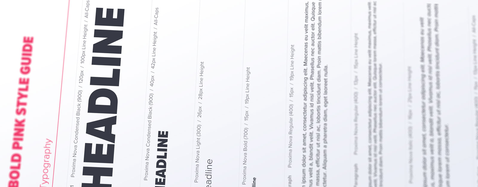
Typography
With Bold Pink freshly affirmed, it was now up us to carry it from the concept phase to a fully operational brand identity. One of the most important tasks at hand was homing in on a typographic arsenal on which to anchor the brand going forward. The search began for a family that could add a new dimension of “boldness,” preserve our unique mix of data-driven humanity, and hold up for any and all use cases.
We finally concluded our search with Mark Simonson’s Proxima Nova. The family is extensive and well-known, but still carries a flavor of premium quality and freshness. It boasts a range of styles that combine to create a powerful voice: Proxima Nova Condensed Black dominates Pendo headlines with editorial audacity, supported by crisp, elegant Proxima Nova Light. Overall the family’s geometric and humanist qualities suit Bold Pink well.
Color Palette
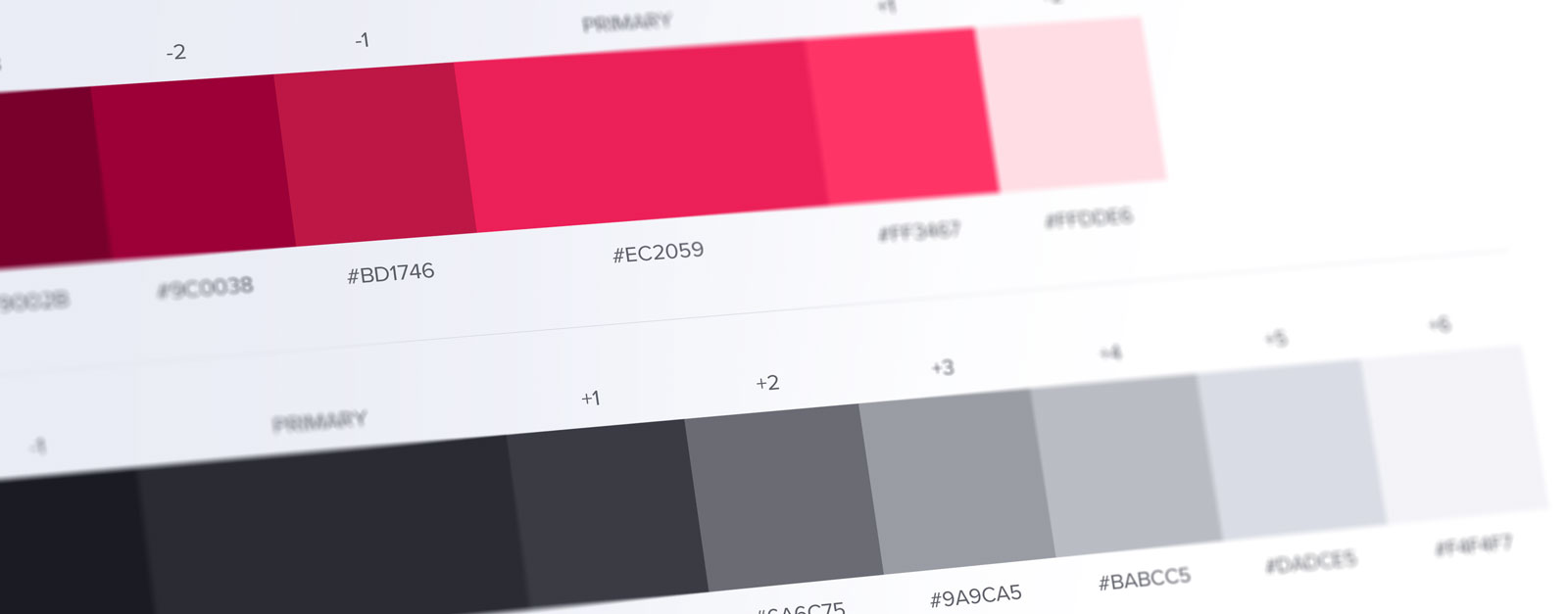
Pendo’s original Navy Blue + Pink palette had served us well, but as we transitioned into our new Bold Pink identity it became apparent that in order to allow pink to come to the forefront of the brand, it would need a more neutral supporting color. As a result we switched to a deep, rich, graphite gray, with a touch of blue to improve contrast and make Pendo Pink “pop.”
In addition to pivoting from blue to gray, we also expanded the official color palette into a range of shades and tints as a roadmap for universal implementations.
![]()
Iconography
Creating a contemporary design language capable of keeping up with Pendo’s complex messages and concepts meant building out an icon library as a visual shorthand for our marketing materials and, in some cases, product UI. We now make use of an ever-expanding library of icons for everything from Guide Analytics to NPS®, accessible to the entire company.
Logo Refresh
The original Pendo logo had served the company well since its beginning, but as the development of Bold Pink progressed, existing concerns with the current logo and its growing disconnect with the new direction came to our attention. There were many opinions on the state of the current logo and how to move forward, so (being the data-driven company that we are) we put together a simple internal survey to gauge overall sentiment. The results were mixed, but two clear learnings emerged:
- Overall, the guidepost symbolism still resonated with respondents, but there was some dissatisfaction with the specific execution of the icon in that it was often confusing or unrecognizable.
- The majority felt that the “pendo” wordmark should remain crisp and modern, but in its current form it felt dated and cliché.
With freshly-baked qualitative data at our disposal, the design team set to work exploring concepts that could perpetuate the much-loved guidepost motif and modern typography within a more solid implementation.
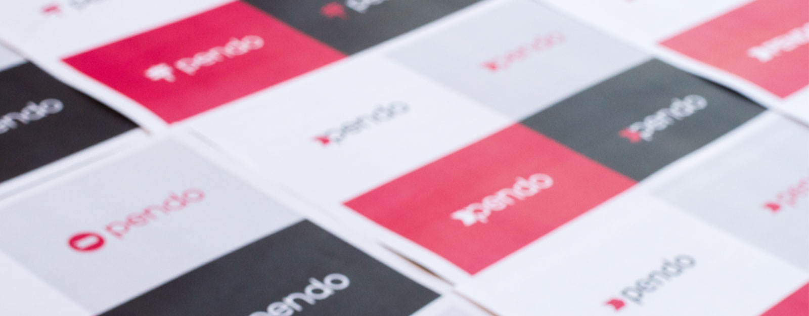
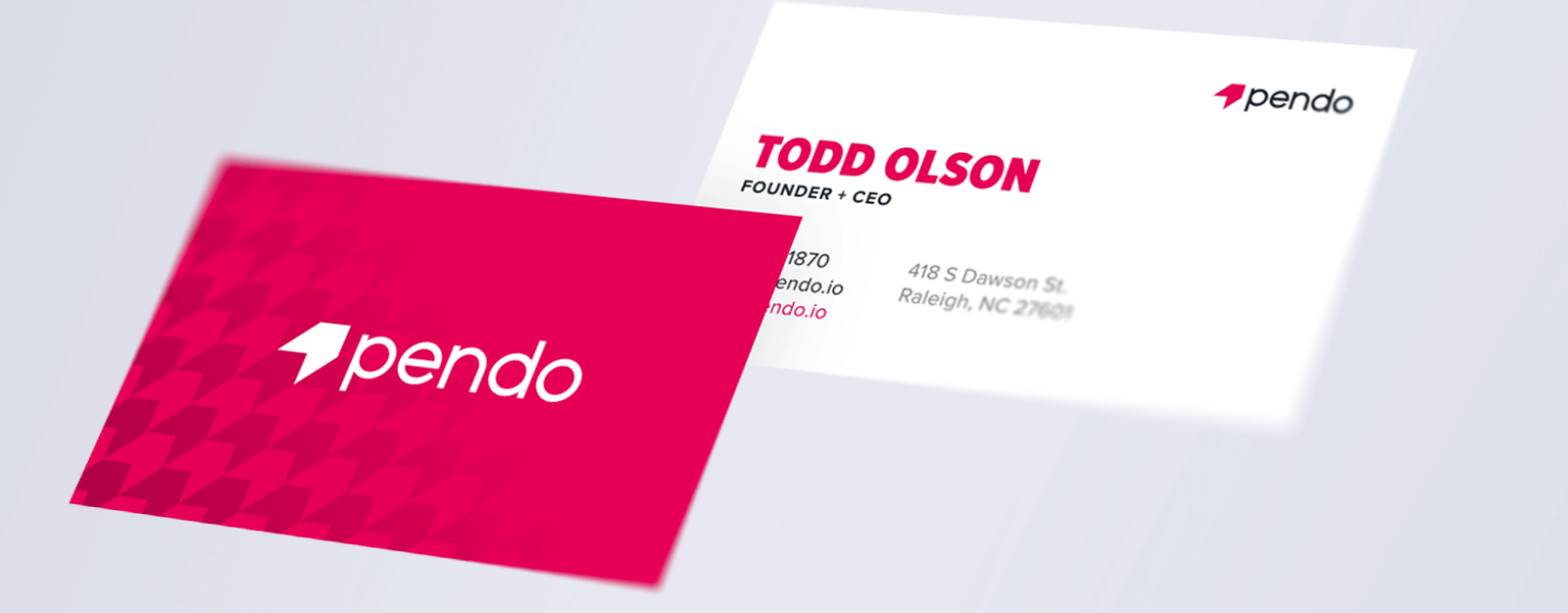
We arrived at the crossroads of symbolism and simplicity by reducing our guidepost down to its most elemental form. The new “chevron” exemplifies the guidance Pendo gives to product and success teams as well as their users. The new wordmark is the result of distilling down the original to its geometric identity while stripping it of its oddities. As a whole, Pendo’s logo exhibits the boldness and power of the brand and the product, but also aligns with the tone of Pendo the company: we will always seek to be defined by quality and clarity rather than flair and excess.
![]()
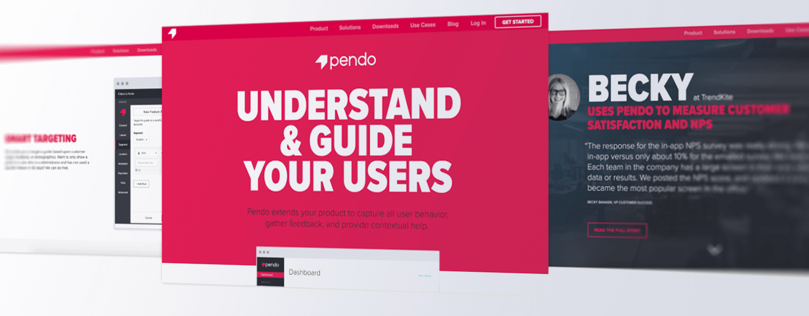
Bringing it All Together
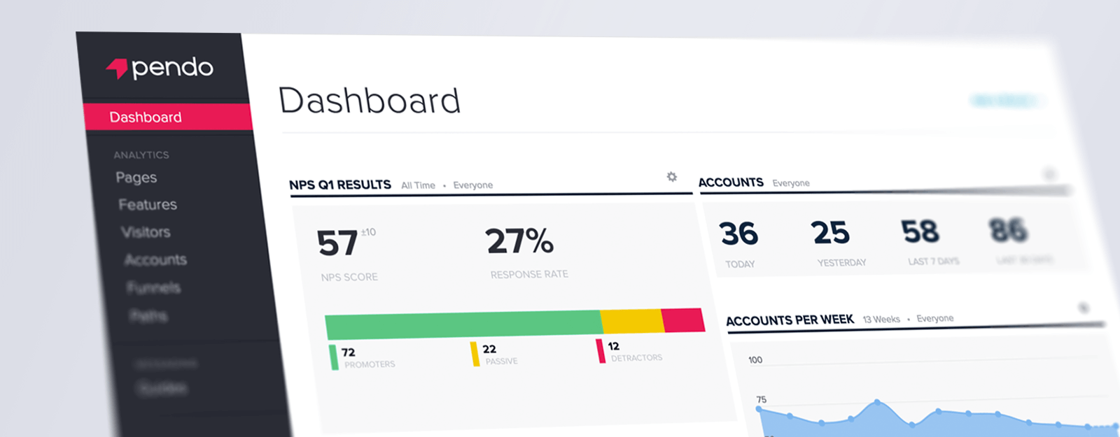
With the building blocks complete, Bold Pink’s implementations began to take shape. The original “Bold Pink” homepage concept was fully realized across the website, new typography and colors were executed within the product UI, and Pendo’s branded materials got a bolder, pinker update.
What’s Next
The conclusion of a brand identity refresh is really just the end of the beginning. From our launch of Bold Pink to this very moment, we’re actively working to establish the system throughout the company. One of the biggest ways we’re accomplishing this task is through the use of an InVision board. All teams at Pendo actively produce their own materials, and our brand board is a fabulous resource that allows the design team to make brand standards, assets, and templates universally accessible and easily updatable.
We couldn’t be more excited about how well our new direction has resonated, and we massively appreciate all of the collaboration of our customers in making it to this point. Keep a close eye on Pendo as we continue our journey to a bolder, pinker future.